Poster Research - Negative Space
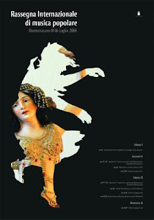
• Negative space is used well in this image to create the silhouette. It creates a unique shape from the positve space. There are almost two levels of negative space, within the silhouette becomes negative space to the photographed image also inside.
• Shape is the most dominant design element in this poster, as it creates the silhouette. Line is very precise and neat around the edge of the shape, creating a cutout effect. The colours are contrasting; the black back negative space compliments the lighter coloured image.
• I like this design because I like the use of the silhouette; its not just a plain cutout image it combines shape with a photograph.
• I would like to incorporate some sort of silhouette and use the strong contrast of light and dark in my poster.

• The negative space in this poster design is used to blend in well and become part of the positive space. The negative space starts at the top and continues between the numerous images to become part of the positive space.
• Line and shape are used hand in hand in this poster, some images are comprised of shapes and others are just simple lines. They are not perfect to give a hand-drawn effect. Texture and shading is also created by line, especially on the trees. In terms of colour, apart from the strong contrast with the black and white which is used to identify the positive in negative space, the user is immediately drawn to the title as it is the only coloured element in the whole design, so colour is used to create hierarchy.
• I like the imperfection of this design, I feel the hand drawn images are more effective in connecting with the audience and resembles live music, as it too is not digitally created, it is phyiscally performed each time by musicians. I like how a series of individual images have all combined to create the larger image to represent a usic festival. I also like the colour scheme, it almost as if it’s a spin off of ‘Sin City’.
• I am influenced by the hand drawn images and use of colour to display hierarchy.

• Negative space is used in this poster design to compliment the positive space, by making the sure the positive space is top of the hierarchy. It creates balance because it is not plain and used solely to outline the positive image, it has so design elements to it.
• The first thing that stands out to me in the poster is colour. Within the postive space the colours are complimentary, bright and vivid. It immediately conveys entertainment to the audience. The black negative space also compliments the positive colours as it makes them stand out more and appear brighter. Shape is used within both the positive and negative space. Some of the images in the positive space are just basic simple shapes and in the negative space shape has been used to make the text a bit more interesting. Line has also been used to show texture on the musician/artist in the centre of the poster.
• What I like about this poster is the use of negative space, its not just there to enhance the positive space, it also requires attention. However, some elements are overused, I feel the overlapping text in the negative space is useless and unnecessary and the way the musician/artist has been designed doesn’t tie in well with the design and looks out of place in my opinion.
• I would like to incorporate a similar use of negative space in my poster, apart from the way the ‘experience’ overlaps everything. I like how there is text used in the negative space but its not important to the reader and no meant to be readable, it just adds a good effect.

• The negative space in this poster appears to be just as important as the positive space, therefore a balance is achieved.
• Shape is the most dominant element in this poster. Again it is used to create a silhouette or both the head and the French horns. Line is used more in the negative space, to show the stave and handwritten music. It’s a contrast from the perfect line of the positive space. Colour is used to contrast, bright versus dark. It also helps to bring balance with the negative space.
• Again I like this poster because I like the silhouette effect, but also I like the contrasting negative space and the way it is almost as important as the positive space.
• What I want to include in my poster design is the different contrasts used in this image and also the creative use of the negative space so that it is not just plain.
Contrast

• In this poster design, contrast is used in the different style of line. The line in the text is informal and made to look like it was handwritten quickly, whereas the line in the image of the horse is formal; it is very precise and defined.
• The line and texture in this poster work hand in hand, the precise lines used to create the image of the horse are used to created texture of the horse's hair. In terms of shape, the image has been cropped and placed on a solid colour background, creating a shape around the positive image. The colours are a bit dull however, which i do not find to be very effective.
• I like how this poster is both simple yet detailed at the same time. The whole layout is simple, while the foreground image is detailed.

• Contrast is used in this poster in the type of lines/shape/pattern. The image of the bird is made up of solid shapes, however, its made to look a little more realistic because there is airbrushed shadow and air coming out of from its mouth. The bird is a solid fill colour whilst the rest of the image, (besides the background) is pattern/airbrush.
• I like the way shape has been used in this image, a series of random shapes make up the bigger shape of the bird. I also like the way texture is included; it could have just been the bird on its own but the airbrush texture coming from the mouth brings it to life. In terms of colour, i think this stands out because most colours are complimented by white, as it is a light and dark contrast.
• I think the simplicity of this poster grabs my attention the most. It doesnt look cluttered and is more concerned with the artwork, hence why the text is so insignificant.


